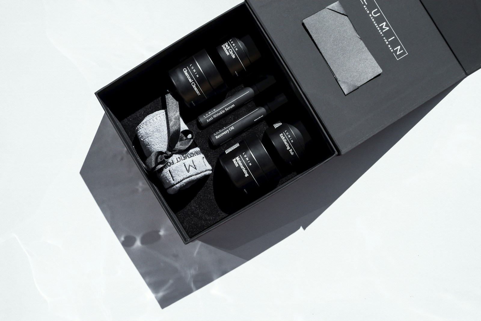
Luxury packaging in the UK has always carried a bit of theatre. Unwrapping a box from Fortnum & Mason or sliding open the heavy carton of a Jo Malone candle isn’t just about protecting what’s inside. It’s about anticipation, ritual. The packaging lingers in memory almost as much as the product itself. And lately, the way brands think about that experience is shifting.
The thing is, the word “luxury” doesn’t mean what it did twenty years ago. Back then, weight and gloss were the calling cards, think thick card stock, gold foiling, maybe a ribbon. Now, it’s a little more complicated. Sustainability has crept in, not as a quiet afterthought but as a headline act. A generation of buyers who grew up with David Attenborough on their screens doesn’t want to see layers of plastic wrap, however shiny. So brands are walking a tightrope: keep the sense of indulgence, but make it guilt-free.
You can see it in how British labels are evolving. Burberry, for instance, reworked its packaging a few years back, using FSC-certified paper and ditching plastic lamination. The muted beige and embossed logo still whispers heritage, but the materials feel more in step with 2025 sensibilities. Jo Malone, too, has been nudging its iconic cream-and-black boxes towards more recyclable options, without losing the understated luxe people expect.
There’s also been a surge in clever engineering – cartons that fold flat, boxes with hidden compartments, partly for efficiency, partly for that little surprise when you open them. Hart & Clough, a Yorkshire-based printer, has leaned into this space, producing cartons and bespoke packaging runs that marry traditional craftsmanship with the demands of modern branding. They’re one of those quiet players behind the scenes, making sure smaller UK brands can look and feel just as polished as the big fashion houses.
Oddly enough, it’s not always the heritage names leading the most interesting experiments. Indie beauty brands popping up in East London or Manchester are tinkering with compostable wraps, seed-paper sleeves, and refillable tins. Luxury in that context isn’t about excess, it’s about cleverness – the sort of packaging you want to show off on Instagram because it folds into a planter or dissolves in water.
What hasn’t changed is the theatre of the unboxing. Walk down Bond Street and peek at a Cartier bag: still a deep red with gold detailing, the sort of thing you don’t chuck in the bin straight away. Same with Fortnum’s hampers, which become picnic baskets and storage boxes long after Christmas is over. Longevity is the quiet luxury trait no one spells out – packaging that earns its keep by living on in your home.
Meanwhile, technology has crept in at the edges. QR codes tucked inside a lid that lead to an exclusive playlist, or augmented reality labels that reveal hidden messages when you hover your phone. It’s not mainstream yet, but some whisky brands and high-end chocolatiers are already dabbling. The idea being: extend the brand story past the moment of unboxing.
Of course, there’s a danger of overthinking it. Not every customer wants packaging that lectures them about carbon emissions or forces them to download an app. The sweet spot seems to be tactile – the feel of the board, the sound when a lid lifts, the faint scent of ink and card. Packaging is physical, and no digital trick can quite replace that.
So where’s it all going? Probably towards a mix: recyclable materials that don’t feel cheap, design flourishes that surprise without tipping into gimmickry, and a continued tug-of-war between tradition and tech. In the UK at least, where heritage brands rub shoulders with scrappy start-ups, that tension is part of the charm. The boxes may look different, but the theatre remains.